Troughs, ridges and shortwaves
- Read first
- Air pressure, The jet stream
- Key terms
- Trough, Ridge, Shortwave trough, Longwave trough, Trough tilt, Rossby wave, Rossby parameter, Hovmöller diagram, Constant-pressure chart, Geopotential height, Thickness, Isotherm, Subsidence, Omega, Closed low, Cutoff low, Blocking, Blocking high, Omega block, Rex block, Heat dome, Teleconnection, Pacific-North American pattern
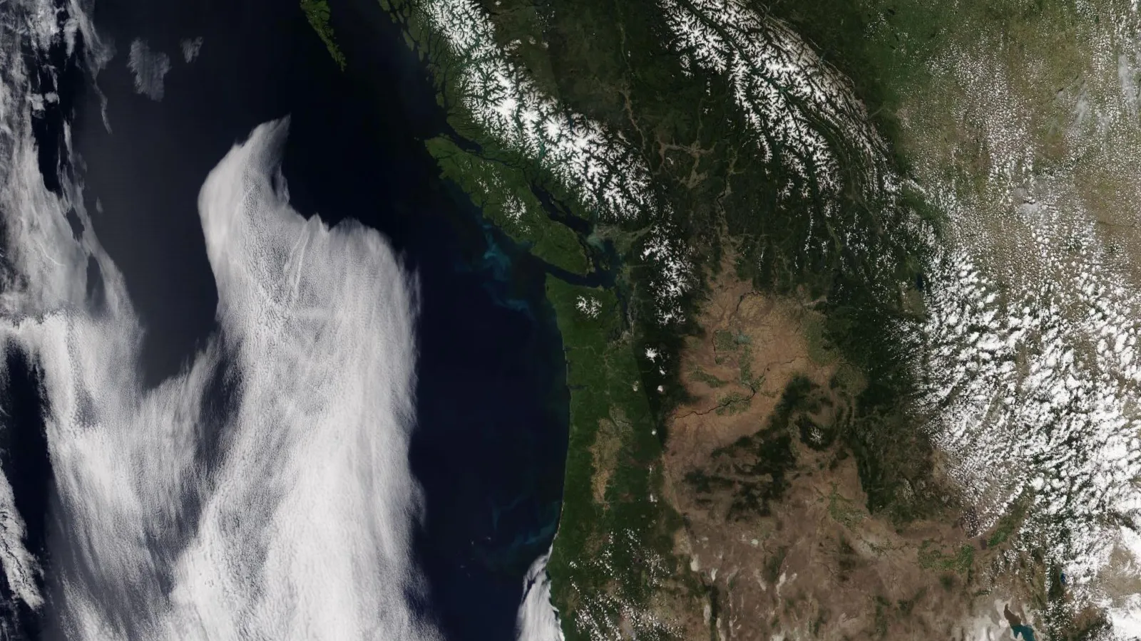
Halfway up the atmosphere the wind does not blow straight from west to east. It swings north and south in waves thousands of kilometers long, and the weather at the ground follows the waves: rain and snow where the flow turns north, clear skies where it turns south, heat under a wave that stalls. This lesson reads those waves on the 500 hPa chart forecasters look at first. It covers troughs and ridges, why the flow is wavy at all, how long waves and short waves differ and move, trough tilt, cutoff lows, blocks, heat domes and the Pacific-North American pattern. Every map is drawn from reanalysis data for a real day: the cold wave of January 2014, the Colorado storm of March 2019, the tornadoes of April 2011, the South Carolina floods of 2015 and the Pacific Northwest heat of June 2021.
- Troughs and ridges: what they are and how to find them on a 500 hPa chart.
- Reading the chart: decameters, the 5,400 and 5,700 m lines, and isotherms.
- Rossby waves: why the flow is wavy, and the formula that says why long waves stall while short waves travel, worked with real numbers.
- Long waves and short waves, and how to tell them apart, on a map and over time.
- The weather under the wave: cloud ahead of the trough, clear sky behind it.
- Tilt, cutoff lows, blocks and heat domes, each on a real case, and the Pacific-North American pattern.
Troughs and ridges
The American Meteorological Society defines a trough as "an elongated area of relatively low atmospheric pressure, almost always associated with and most clearly identified as an area of maximum cyclonic curvature of wind flow," and a ridge as the opposite: "an elongated area of relatively high atmospheric pressure, almost always associated with and most clearly identified as an area of maximum anticyclonic curvature of wind flow." The axis of a trough is the trough line, "a line along which pressures are lower than in the surroundings and where the cyclonic curvature of the isobars is a maximum."[1] The words distinguish open waves from closed circulations: a trough is not yet a low, though "a large-scale trough may include one or more lows."[1]
Aloft the same shapes appear in the height contours of a constant-pressure chart, which the air pressure lesson introduced: a map of the height at which a given pressure is found. In the Northern Hemisphere a trough is a southward dip of the contours and a ridge a northward bulge. NOAA's JetStream course ties them to temperature: "The areas of lower heights (colder, more dense air) are called troughs. The regions of higher heights (warmer, less dense air) are called ridges." By convention troughs are drawn as dashed lines and ridges as zigzag lines.[4]
- Height, every 60 m, labeled in decameters
- 5,400 and 5,700 m
- Temperature, every 5 °C
- Trough axis
- Ridge axis (zigzag)
Table: 500 hPa height and temperature along 45° N, January 6, 2014
| Longitude | Height, m | Temperature, °C |
|---|---|---|
| 140° W | 5,594 | -19.6 |
| 130° W | 5,688 | -18.9 |
| 120° W | 5,743 | -18.8 |
| 110° W | 5,569 | -20.8 |
| 100° W | 5,243 | -35.8 |
| 90° W | 5,074 | -38.2 |
| 80° W | 5,230 | -28.6 |
| 70° W | 5,517 | -19.3 |
| 60° W | 5,643 | -19.8 |
On this day the air at 500 hPa over the Midwest was colder than −38 °C. The trough is deep, and the contours in it are packed close; the ridge over the West is broad. Read with the hypsometric equation in mind, the shapes are a temperature map: the 500 hPa surface lies 669 m lower at 90° W than at 120° W because the column below it is much colder, and the isotherms dip south with the contours. The wind at 500 hPa blows nearly along the contours, faster where they are packed, so a trough is also where the flow swings from northwesterly to southwesterly and a ridge where it swings back. Why the wind follows the contours is the subject of What makes the wind blow.
Reading a 500 hPa chart
JetStream calls the 500 hPa chart "the mainstay of the upper air charts. If meteorologists could only look at one chart, the 500 mb level chart would, by far, be the top choice." The surface ranges from about 4,980 to 6,000 m above sea level and sits near the middle of the atmosphere's mass.[5] Four conventions cover most of what is printed on it.
- Heights in decameters
- The contours are labeled in decameters, tens of meters, with the last zero dropped: "a height value of '564' means the actual height is 5,640 meters." Contours are usually drawn every 60 m.[5][6] A geopotential height is close enough to a height in meters for any reading of the chart.
- Low heights are cold
- Heights fall toward the pole because the air is colder there. Troughs are cold pockets, ridges warm ones.[4]
- Wind along the contours
- The wind at 500 hPa blows nearly parallel to the contours, with lower heights on its left in the Northern Hemisphere, and it is stronger where the contours are packed.[4]
- Isotherms
- Dashed lines of equal temperature at 500 hPa, often every 5 °C. Where isotherms cross the contours the wind is carrying warm or cold air, which is what deepens or weakens a trough.
Two contours are often drawn heavier. The 5,400 m line is borrowed from the thickness chart, where, in JetStream's words, "the 540-thickness line (5,400 meters deep) is approximately the point where precipitation changes from liquid to frozen."[6] The two are not the same line. The height of the 500 hPa surface is the height of the 1000 hPa surface plus the 1000 to 500 hPa thickness, and the 1000 hPa surface rises about 8 m for each hectopascal of sea-level pressure above 1000. Under a 1024 hPa high the 5,400 m thickness line lies under the 5,590 m height contour, not the 5,400 m one. Computed here. The heavier lines are better read as markers of the season and the air mass, as the climatology shows.
| Along 100° W, 1991 to 2020 average | January | July |
|---|---|---|
| Latitude of the 5,400 m contour | 48.5° N | north of 80° N |
| Latitude of the 5,700 m contour | 32.5° N | 53.7° N |
| Latitude of the 5,880 m contour | none (highest 5,861 m, near 15° N) | 41.9° N |
| 500 hPa height and temperature at 40° N | 5,568 m, −21.9 °C | 5,898 m, −7.3 °C |
| 500 hPa height and temperature at 50° N | 5,368 m, −28.8 °C | 5,757 m, −12.3 °C |
Monthly means from the NCEP/NCAR Reanalysis; computed here.[8] In an average January the 5,400 m contour crosses the northern Plains and the 5,700 m contour the Gulf Coast states; by July the 5,700 m line has moved to central Canada and the 5,880 m line, the edge of the summer subtropical high, lies across the central United States. A 5,400 m contour over Texas or a 5,880 m contour over Canada is therefore a sign of an unusual air mass before any other number is read.
Why the flow is wavy: Rossby waves
The waves are called Rossby waves or planetary waves. JetStream traces them to geography: the earth "heats unevenly from the sun due to the different shapes and sizes of the land mass," and "since air can't travel through a mountain, it must rise up and over or go around." Both disturb the westerlies, and the disturbances take the form of waves; there are usually four or five of them around the hemisphere, and "the number of longwaves at any one time varies from three to seven."[2] The waves also do work: they "help to transfer heat from the tropics toward the poles and cold air from the poles toward the tropics."[2]
What makes a wave rather than a random wobble is the earth's rotation, and specifically the way its effect changes with latitude. The AMS describes the Rossby wave as a wave "conserving absolute vorticity" that "takes into account the variability of the Coriolis parameter."[1] The Coriolis parameter grows toward the pole. Air pushed north moves to where the planet's own spin about the vertical is greater, and to keep its total spin the air must take on clockwise spin of its own, which curves it back south; air pushed south curves back north for the same reason. The result is an oscillation about the undisturbed latitude. Spin measured this way is vorticity, the subject of the vorticity lesson. The rate at which the Coriolis parameter grows northward is the Rossby parameter:
β = 2Ω cos φ / a
where Ω is the earth's rate of rotation, 7.292 × 10⁻⁵ per second, φ the latitude and a the earth's radius, 6,371 km.[1] At 45° N it is 2 × 7.292 × 10⁻⁵ × 0.707 / 6.371 × 10⁶ m = 1.62 × 10⁻¹¹ per meter per second. In words: moving 1,000 km north at 45° raises the Coriolis parameter by 1.6 × 10⁻⁵ per second, about a sixth of its value there. Computed here.
How fast the waves move
The AMS gives the speed of a Rossby wave on a uniform westerly current as the Rossby formula, also called the long-wave formula:[1]
c = U − β / K²
Here c is the wave's eastward speed over the ground, U the mean westerly wind, and K the total wavenumber. For a wave with no north-south structure K = 2π/L, where L is the wavelength, so c = U − β (L/2π)². In words: the wind carries the wave east, and the Rossby mechanism pushes it back west, harder the longer the wave. A wave of one particular length holds still:
Ls = 2π √(U / β)
A worked example with real numbers. In January and February 2014 the mean 500 hPa westerly wind along 45° N was U = 18.7 m/s. With β = 1.62 × 10⁻¹¹, the stationary wavelength is 2π × √(18.7 / 1.62 × 10⁻¹¹) = 6,750 km. The circle of latitude at 45° N is 28,300 km around, so about four stationary waves fit around the hemisphere. A short wave 3,000 km long moves at 18.7 − 1.62 × 10⁻¹¹ × (3.0 × 10⁶ / 2π)² = 18.7 − 3.7 = 15.0 m/s, 1,300 km a day, east. A long wave of three around the hemisphere, 9,400 km, has c = −17.8 m/s: it should drift west. Computed here.[8]
- Rossby formula, 45° N
- Short waves, measured from the Hovmöller diagram
Table: Rossby wave speed at 45° N for U = 18.7 m/s
| Waves around the latitude | Wavelength, km | Speed, m/s | km per day |
|---|---|---|---|
| 1 | 28,306 | -309.8 | -26,768 |
| 2 | 14,153 | -63.4 | -5,481 |
| 3 | 9,435 | -17.8 | -1,539 |
| 4 | 7,076 | -1.8 | -159 |
| 5 | 5,661 | 5.6 | 480 |
| 6 | 4,718 | 9.6 | 826 |
| 8 | 3,538 | 13.6 | 1,171 |
| 10 | 2,831 | 15.4 | 1,331 |
| 12 | 2,359 | 16.4 | 1,418 |
The formula gets the order right: short waves travel east, and long waves stall. It gets the amounts wrong. The long waves in 2014 did not race west at 18 m/s; they drifted east at 0.7 m/s. The short waves moved east at 8.7 m/s, not 13 to 15. To move at 8.7 m/s, a 3,000 km wave would need a mean westerly of 12.4 m/s, two thirds of the wind measured at 500 hPa. Computed here. The AMS is candid about the gap: the formula matters in a simple barotropic model, "but attempts to apply the formula to actual contour patterns considered as waves have less dynamic justification and correspondingly less success."[1] The real atmosphere has mountains and coastlines that hold the longest waves near fixed places, and winds that change with height, neither of which the formula knows about. The stationary wavelength also changes with the season: the 1991 to 2020 mean westerly at 45° N is 14.5 m/s in January and 10.7 m/s in July, which gives stationary wavelengths of 5,950 and 5,110 km. Computed here.
Long waves and short waves
The AMS separates the two by size. A long wave is "a wave in the major belt of westerlies that is characterized by large length and significant amplitude," with "angular wavenumber … generally taken to be from 1 to 5." A short wave is "a progressive wave in the horizontal pattern of air motion with dimensions of cyclonic scale," which "moves in the same direction as that of the prevailing basic current," with wavenumbers "between eight and twenty."[1] JetStream puts long waves at 6,000 to 8,000 km or more, and short waves at under 6,000 km, moving east "on average of 23 mph (20 kts, 37 km/h) in summer and 35 mph (30 kts, 55 km/h) in winter."[2]
Forecasters have many names for a short wave: in JetStream's list, "a 'piece of energy', 'vort max' (or 'vorticity maximum'), 'pocket of cold air' (or 'pocket of energy'), 'upper level disturbance', 'upper level energy', or just 'shortwave'."[2] The second name says what a short wave is to a forecaster: a moving spot of high vorticity, which the vorticity lesson follows in detail. JetStream also warns that "it can be difficult to discern a shortwave embedded within a longwave by looking at a static map. Looping images of the wave patterns are often needed to determine the difference between them."[2]
One way to separate them on a single map is to split each circle of latitude into its waves (a Fourier analysis) and keep only the longest ones. What is left is the short-wave part.
- Height, every 60 m (decameters)
- Short waves raise the height
- Short waves lower the height
- Short-wave trough axis
Table: the split along 45° N, January 22, 2014 (m)
| Longitude | Full height | Long-wave part | Short-wave part |
|---|---|---|---|
| 160° W | 5,136 | 5,260 | -124 |
| 150° W | 5,373 | 5,405 | -32 |
| 140° W | 5,672 | 5,581 | 91 |
| 130° W | 5,752 | 5,717 | 35 |
| 120° W | 5,691 | 5,743 | -52 |
| 110° W | 5,649 | 5,631 | 18 |
| 100° W | 5,429 | 5,427 | 2 |
| 90° W | 5,181 | 5,229 | -48 |
| 80° W | 5,158 | 5,139 | 19 |
| 70° W | 5,213 | 5,204 | 9 |
| 60° W | 5,425 | 5,392 | 33 |
| 50° W | 5,605 | 5,608 | -3 |
| Long wave | Short wave | |
|---|---|---|
| Wavelength | 6,000 to 8,000 km or more | Under 6,000 km; cyclones 1,000 to 4,000 km |
| Waves around the hemisphere | 1 to 5; usually 4 or 5 present | 8 to 20 |
| Motion | Slow, sometimes stationary or westward | East, with the flow |
| Measured, January and February 2014 | 0.8° of longitude a day | 10° of longitude a day, 750 km |
| On the map | The broad, persistent troughs and ridges | Kinks and small troughs that travel through them |
| Weather | Sets the pattern for days to weeks | Brings each episode of cloud and precipitation |
Definitions from the AMS and JetStream; the measured speeds are computed here from the reanalysis.[1][2][8] On a single chart, a trough that spans a quarter of the hemisphere and has been in the same place for days is a long wave; a small bend in the contours, often with a tight spot of packed contours and a patch of cloud on satellite, is a short wave. The test that settles it is time: compare the chart with the one 12 or 24 hours earlier.
Watching the waves move
A Hovmöller diagram puts that comparison on one page. The AMS describes it as a diagram showing "isopleths of atmospheric variation, such as pressure or thickness, usually averaged over a band of latitude. Time is usually on one axis, longitude the other."[1] A feature that stays put draws a vertical band; one that moves east draws a stripe slanting down to the right, and the slope of the stripe is its speed.
- Higher than the latitude mean (ridge)
- Lower (trough)
- Slope of 10° of longitude a day
Table: long-wave part of the 40° to 55° N mean height (m), weekly
| Date | 150° W | 125° W | 100° W | 80° W | 60° W |
|---|---|---|---|---|---|
| Jan. 1 | 71 | 275 | 5 | -247 | -175 |
| Jan. 8 | 28 | 192 | -29 | -246 | -158 |
| Jan. 15 | 102 | 372 | -50 | -160 | 112 |
| Jan. 22 | 22 | 311 | 2 | -281 | -83 |
| Jan. 29 | 119 | 231 | -34 | -244 | -44 |
| Feb. 5 | 145 | 101 | -41 | -85 | -18 |
| Feb. 12 | -96 | 44 | 22 | -136 | -138 |
| Feb. 19 | 54 | 32 | -61 | -54 | -17 |
| Feb. 26 | -64 | 166 | -44 | -328 | -283 |
The measured speeds come from matching each day's pattern to the next day's. The short-wave part moved east 10.0° of longitude a day, which at 47.5° N is 751 km a day, 8.7 m/s; using only wavenumbers 8 to 20 gives 10.8° a day. The long-wave part moved 0.8° a day. Computed here. The short waves of those two months were slower than JetStream's winter average of 30 knots, 15 m/s.[2] The change between the halves of the diagram is also real: the Climate Prediction Center's Pacific-North American index went from +0.97 in January 2014 to −0.95 in February, a shift taken up in the last section.[17]
The weather under the wave
JetStream states the rule every forecaster learns first: "fair (or improving) weather conditions generally occur between the ridge and the downwind trough. Unsettled (or deteriorating) weather generally occurs between the trough and the downwind ridge."[4] Put another way, cloud and precipitation lie ahead of a trough, on its east side, and clear skies lie behind it and under the ridge. The reason is vertical motion. Ahead of a trough air rises across a broad region, cools as it rises and condenses; behind it, air sinks, warms by subsidence and dries. The National Weather Service defines a shortwave as "a disturbance in the mid or upper part of the atmosphere which induces upward motion ahead of it."[7] Why the air rises there, through divergence aloft and the quasi-geostrophic picture of ascent, is the subject of Why air rises. Here the pattern itself is enough.
- 500 hPa height, every 60 m (decameters)
- Trough axis
- Rising air (negative omega)
- Sinking air (positive omega)
- 500 hPa height, every 60 m
- Trough axis
- Ridge axis (zigzag)
Table: 500 hPa vertical motion (omega, Pa/s) along 38° N, 18 UTC March 13, 2019; negative is rising
| Longitude | Height, m | Omega, Pa/s |
|---|---|---|
| 125° W | 5,671 | -0.01 |
| 120° W | 5,576 | 0.28 |
| 115° W | 5,470 | 0.39 |
| 110° W | 5,418 | 0.00 |
| 105° W | 5,357 | -0.22 |
| 100° W | 5,350 | -0.21 |
| 95° W | 5,526 | -0.23 |
| 90° W | 5,722 | -0.12 |
| 85° W | 5,782 | 0.04 |
| 80° W | 5,776 | 0.10 |
| 75° W | 5,755 | 0.09 |
The two maps agree: the cloud shield on the satellite image sits over the red area of rising air, and the clear sky over Arizona and New Mexico over the blue area of sinking air. In omega, a rise of 1 Pa/s is about 15 cm/s near 500 hPa, where the air's density is about 0.69 kg/m³ (computed here): slow next to a thunderstorm updraft, but sustained across a region the size of several states. At the ground this storm was a record. The National Weather Service in Pueblo reported that "the lowest recorded pressure was 970.4 hPa over Lamar, Colorado, which is the official state record for lowest pressure ever recorded outside of a tornado"; Colorado Springs recorded a gust of 96 mph and hours of blizzard conditions.[10] Lamar lies at 38.1° N, 102.6° W, almost directly under the 500 hPa low.
Trough tilt
A trough axis seldom runs straight north and south. The National Weather Service defines a positive-tilt trough as "an upper level system which is tilted to the east with increasing latitude (i.e., from southwest to northeast)," often "a sign of a weakening weather system," and a negative-tilt trough as one "tilted to the west with increasing latitude (i.e., with an axis from southeast to northwest)," which "often is a sign of a developing or intensifying system."[7] A trough with a north-south axis is neutral. See trough tilt in the glossary.
JetStream describes the sequence: negatively tilted troughs "usually begin as positive tiled troughs. As the shortwave energy races east though the longwave, it distorts its shape from positive to neutral (north-south) orientation to a negative (northwest to southeast) orientation." It also gives the reason they matter: "Because a negatively tilted trough typically means a strong surface low is developing, this results in a large change in wind direction from the surface into the upper atmosphere (called wind shear), which aids in the formation of supercell thunderstorms." Positive-tilt troughs "produce the least amount of severe weather."[3] The wind shear that follows is what the tornado lesson builds on.
- Height, every 30 m (decameters)
- Trough axis, from minima along latitude circles
Table: the trough axis, south and north ends
| Time | South end | North end | Tilt |
|---|---|---|---|
| January 6, 2014 (daily mean) | 30° N, 93.1° W | 56° N, 85.8° W | Positive (southwest to northeast) |
| 00 UTC April 17, 2011 | 30° N, 86° W | 52° N, 94.8° W | Negative (northwest to southeast) |
The second map is the evening of April 16, 2011, when tornadoes swept eastern North Carolina. The National Weather Service office at Newport and Morehead City wrote that "a vigorous negative tilt mid level trough (Figure 2) provided strong positive vorticity advection," with its figure captioned "500 mb Analysis at 00Z April 17, 2011 showing mid-level trough becoming negatively tilted." Twelve tornadoes were confirmed in its area, with damage up to EF3, and hundreds of homes were damaged or destroyed.[11] Tilt alone never makes an outbreak; the moisture and instability of the CAPE lesson have to be there too. It is one of the first things to check on the morning chart.
Closed lows and cutoff lows
A closed low is "a low that may be completely encircled by an isobar or contour line." On upper-level charts the term is used "to accentuate the fact that the circulation is closed, especially at levels and over latitudes where such an occurrence is unusual."[1] A cutoff low goes further. The AMS calls it "a cold low that has grown out of a trough and become displaced out of the basic westerly current and lies equatorward of this current."[1] The National Weather Service adds that cutoff lows "may remain nearly stationary for days, or on occasion may move westward opposite to the prevailing flow aloft," and asks that the term be reserved "only to those closed lows which clearly are detached completely from the westerlies."[7]
JetStream gives the forecaster's view with an old rhyme, "Cut-off low, weatherman's woe." They "usually result from a strong shortwave moving south on the west side of troughs," and models "still tend to forecast the closed low pressure to 'open up' and rejoin the main airflow aloft too quickly." Unsettled weather lies over their eastern half.[3]
- Height, every 30 m (decameters)
- Center of the closed low, daily
Table: the lowest 500 hPa height over the Southeast, daily mean
| Date | Lowest height, m | Latitude | Longitude | Closed |
|---|---|---|---|---|
| Sept. 30 | 5,767 | 42.0° N | 81.3° W | no |
| Oct. 1 | 5,752 | 38.5° N | 87.0° W | no |
| Oct. 2 | 5,717 | 33.5° N | 86.8° W | yes |
| Oct. 3 | 5,680 | 32.3° N | 86.0° W | yes |
| Oct. 4 | 5,698 | 31.3° N | 82.8° W | yes |
| Oct. 5 | 5,729 | 30.3° N | 80.0° W | yes |
| Oct. 6 | 5,786 | 32.3° N | 76.5° W | yes |
| Oct. 7 | 5,743 | 42.0° N | 72.0° W | no |
That low set up the South Carolina floods of October 1 to 5, 2015. The National Weather Service assessment of the event names "a stalled surface frontal boundary off the coast, a slow moving upper low west of the Carolinas and ample Atlantic moisture," fed by "a persistent plume of tropical moisture associated with Hurricane Joaquin," which together "produced more than 20 inches of rain in central and coastal sections of South Carolina." Mount Pleasant recorded 26.88 inches, Columbia set records of 6.71 inches in a day and 10.28 in two, and 19 people died in the flooding.[12] The rain fell for days in the same place because the low aloft barely moved and kept the moist onshore flow aimed at the same coast.
Blocking patterns
When a large high or low aloft stops moving, the whole pattern stops with it. The AMS defines blocking as "the obstructing, on a large scale, of the normal west-to-east progress of migratory cyclones and anticyclones," attended by "pronounced meridional flow in the upper levels, often comprising one or more closed anticyclonic circulations at high latitudes and cyclonic circulations at low latitudes." The block "typically remains nearly stationary or moves slowly westward, and persists for a week or more," and in the Northern Hemisphere prolonged blocking "occurs most frequently in the spring over the eastern North Atlantic and eastern North Pacific regions."[1] Its anchor is a blocking high, a high that "remains nearly stationary or moves slowly compared to the west-to-east motion 'upstream' from its location."[1]
Two shapes have names.
- Omega block
- "Omega blocks get their name because the upper air pattern looks like the Greek letter omega (Ω). Omega blocks are a combination of two cutoff lows with one blocking high sandwiched between them." They are "often quite persistent and can lead to flooding and drought conditions, depending upon the location under the pattern."[3] See omega block.
Both have appeared already in this lesson. The National Weather Service office in Little Rock described the South Carolina low as a Rex block: the storm "had a hard time going anywhere given high pressure to the north, a pattern called a 'Rex block' (named after Dr. Daniel F. Rex, who identified the pattern in 1950)." Charleston measured 11.50 inches of rain on October 3, its wettest day on record.[13] The omega block is the next section.
Summer ridges and heat domes
In summer the westerlies retreat north and weaken, as the average contours and winds above showed, and the subtropical ridge spreads over much of the United States. Days under a strong ridge are hot, dry and settled, and JetStream notes that blocking highs are "typically a summertime occurrence" and "responsible for major heat waves." High pressure aloft "causes the air to subside or sink. This downward motion compresses and warms the air in the lower atmosphere," and "the skies are usually clear due to the downward motion of air." The heat ends when "a shortwave moves over the top of the high."[3]
The news term for the extreme case is heat dome, which the AMS now defines: "an exceptionally warm air mass at middle latitudes during the warm season that is associated with a synoptic-scale area of high pressure aloft," which "can have a doming effect on the warm air mass below by suppressing rising motion and the development of clouds and precipitation." The heat "can persist for several days because the flow aloft is often calm and stagnant, especially when the upper-level high pressure can be characterized as a blocking high."[1]
- Higher than the 1991 to 2020 average
- Lower than average
- Height, every 60 m (decameters)
Table: 500 hPa height along 50° N, June 27, 2021, and the 1991 to 2020 average for the date (m)
| Longitude | June 27, 2021 | Average | Departure |
|---|---|---|---|
| 150° W | 5,640 | 5,634 | 6 |
| 140° W | 5,800 | 5,644 | 156 |
| 130° W | 5,921 | 5,670 | 251 |
| 120° W | 5,980 | 5,707 | 273 |
| 110° W | 5,873 | 5,723 | 150 |
| 100° W | 5,731 | 5,716 | 15 |
| 90° W | 5,703 | 5,706 | -3 |
| 80° W | 5,719 | 5,688 | 31 |
This is the ridge behind the Pacific Northwest heat wave of late June 2021. James Overland wrote that "this ridge featured a maximal 500 hPa geopotential height of ~5980 m that is unprecedented for this area of western North America for the period from 1948 through to June 2021. Such a feature is termed an Omega Block weather pattern, and it contributed to the persistence of the heating event."[14] The weather balloon at Quillayute found the 500 hPa surface at 5,975 m at 12 UTC June 28, with a temperature there of −2.5 °C.[16] The reanalysis peak for the ridge, day by day, rose from 5,922 m on June 25 to 5,981 m on June 27 and fell to 5,938 m by July 1 as the high drifted inland. Computed here.
On the ground, White and colleagues report that "the Canadian national temperature record was broken 3 days in a row, at multiple locations, with the highest temperature of 49.6 °C recorded in Lytton, BC, on 29 June," 4.6 °C above the previous national record, and they count at least 868 deaths attributed to the heat across the region. Their trajectory analysis is a useful check on the "dome" picture: about 78 percent of the warming of the air near the ground over four days came from diabatic heating, such as condensation in clouds upstream and heating by the sunlit ground, and about 22 percent, some 4 K, from "adiabatic processes associated with net subsidence."[15] Sinking air under the ridge helped, as the adiabatic cooling lesson explains, but it was the clear skies and the stalled pattern, day after day at the longest days of the year, that did most of the work.
The Pacific-North American pattern
Long waves are not independent from one ocean to the next. A teleconnection is, in the AMS definition, "a linkage between weather changes occurring in widely separated regions of the globe," most commonly "applied to variability on monthly and longer timescales."[1] For North America the most important is the Pacific-North American pattern. The Climate Prediction Center describes it: "The positive phase of the PNA pattern features above-average heights in the vicinity of Hawaii and over the intermountain region of North America, and below-average heights located south of the Aleutian Islands and over the southeastern United States." The positive phase brings "above-average temperatures over western Canada and the extreme western United States, and below-average temperatures across the south-central and southeastern U.S.," and it "tends to be associated with Pacific warm episodes (El Niño)."[17]
- Higher than the 1991 to 2020 monthly average
- Lower than average
- Monthly mean height, every 60 m
Table: monthly height departures at the four PNA centers (m)
| Month | CPC PNA index | Hawaii | Aleutians | Intermountain West | Southeast US |
|---|---|---|---|---|---|
| January 2014 | 0.97 | -34 | -27 | +55 | -49 |
| February 2014 | -0.95 | 0 | +17 | -21 | -1 |
The monthly maps are the long waves of the Hovmöller diagram, averaged. The January pattern is the one on the first chart of this lesson, and it shows why a positive PNA in winter points to cold in the south-central and southeastern states. An index is a summary of a pattern, not the pattern: the four named places do not all behave in any one month, and the map is always worth looking at.
A checklist for the 500 hPa chart
- Find the long waves. Where are the big troughs and ridges, and how many fit across North America and the Pacific? Compare with yesterday's chart: they should have moved little.
- Read the numbers. Heights in decameters; where do the 540, 570 and 588 contours lie against where they usually lie for the month?
- Find the short waves. Look for kinks, small troughs and tight bends, and follow them on a loop. Each one is a coming episode of cloud and precipitation east of it.
- Check the tilt. A trough turning from positive to neutral to negative tilt is strengthening; with moisture and instability underneath, that is a severe weather signal.
- Look for closed contours. A closed low cut off south of the westerlies will be slow, and slower than the models say.
- Look for blocks. A high poleward of a low, or a high between two lows, means the weather now is the weather for several days.
- Match it to the satellite image. Cloud ahead of the troughs and clear sky under the ridges is the check that the chart has been read right.
Check yourself
-
On a 500 hPa chart, one city lies under the 552 contour and another under the 582 contour. Which has the colder air below it, and how high is the 500 hPa surface over each?
Answer
The first: 552 is 5,520 m and 582 is 5,820 m, and lower heights mean a colder, denser column below.
-
A trough axis runs from central Texas northeast to Lake Michigan. What is its tilt, and what does it suggest?
Answer
Positive tilt: the north end is east of the south end. The National Weather Service calls it often a sign of a weakening system, less likely than a negative-tilt trough to bring severe weather, other things being equal.
-
By the Rossby formula, why do long waves stall or drift west while short waves move east?
Answer
The speed is the westerly wind minus β(L/2π)², a westward push that grows with the square of the wavelength. For short waves it is small and the wind carries them east; for waves longer than about 6,000 to 7,000 km in winter it equals or exceeds the wind.
-
Where, relative to a trough, would you expect cloud and precipitation, and where clear skies?
Answer
Cloud and precipitation between the trough and the ridge downstream of it, on the east side, where the air rises; clear skies between the ridge and the next trough, behind the trough and under the ridge, where the air sinks.
-
What is the difference between a closed low and a cutoff low?
Answer
A closed low is any low encircled by a contour. A cutoff low is a closed low that has become completely detached from the westerlies, south of them, and moves independently, often slowly or even westward.
-
On a Hovmöller diagram of 500 hPa heights, what do a vertical band and a stripe slanting down to the right mean?
Answer
With time running down the page, a vertical band is a feature that stays at the same longitude, a stationary long wave; a stripe slanting down and to the right is a feature moving east, a short wave. The flatter the stripe, the faster it moves.
-
In the positive phase of the PNA pattern, where are 500 hPa heights above average?
Answer
Near Hawaii and over the intermountain region of North America. Heights are below average south of the Aleutian Islands and over the southeastern United States.
Video

Methods
All maps and diagrams are drawn from the NCEP/NCAR Reanalysis 1, on its 2.5° grid, subset from
NOAA's Physical Sciences Laboratory: daily means for January and February 2014, January 6,
2014, October 2015 and June 2021; six-hourly analyses for 18 UTC March 13, 2019 and 00 UTC April
17, 2011; monthly means and the 1991 to 2020 daily and monthly averages. Fields are resampled
with bicubic interpolation and contoured by marching squares on a 0.5° lattice, then drawn on a
Lambert conformal map with Natural Earth coastlines and borders.[18] Trough and ridge axes join the
lowest (or highest) heights along circles of latitude, 0.5° or 1° apart. The long-wave part of a
field is the sum of zonal wavenumbers 0 to 5 around each circle of latitude; the short-wave part
is the remainder. For the Hovmöller diagram the height is averaged from 40° to 55° N, weighted
by the cosine of latitude, and the wave speeds are the eastward shift that best correlates each
day's pattern with the next day's, over all 58 pairs of days. The Rossby formula uses β at 45° N
and the mean 500 hPa zonal wind along 45° N over the same two months. The satellite images are
VIIRS corrected reflectance from NASA's Global Imagery Browse Services, reprojected to the same
map. The Quillayute heights are from the University of Wyoming's sounding archive, and the PNA
index from the Climate Prediction Center. The code and data are in the site's repository, in
scripts/learn/troughs-ridges-and-shortwaves.mjs,
scripts/learn/troughs-ridges-and-shortwaves-fetch.mjs,
scripts/learn/upper-air-map.mjs and
scripts/learn/troughs-ridges-and-shortwaves-data/.
Related
Constant-pressure charts and the hypsometric equation are in Air pressure; subsidence and the warming of sinking air in Air parcels and adiabatic cooling and Inversions and the cap; what the troughs do for thunderstorms in How tornadoes form. The next lessons in this unit are Vorticity and Why air rises. Forecasts for any place are in Forecast, and long-term records in Climate. Unfamiliar terms are in the glossary.
Sources
Quotations are verbatim from the source named. Figures and numbers marked "computed here" are described under Methods.
- American Meteorological Society, Glossary of Meteorology, entries trough, ridge, trough line, contour line, Rossby wave, Rossby parameter, long wave, short wave, cyclone wave, Hovmöller diagram, closed low, cutoff low, cutting-off process, blocking, blocking high, heat dome, teleconnection and Pacific–North American pattern. The Rossby wave entry cites J. R. Holton, An Introduction to Dynamic Meteorology, 3rd edition, Academic Press, 1992, pages 216 to 222.
- NOAA JetStream, Longwaves and Shortwaves.
- NOAA JetStream, Basic Wave Patterns.
- NOAA JetStream, Common Features of Constant Pressure Charts.
- NOAA JetStream, Constant Pressure Charts: 500 mb.
- NOAA JetStream, Constant Pressure Charts: Thickness.
- National Weather Service glossary, entries negative-tilt trough and positive-tilt trough, shortwave, cutoff low and Rex block.
- E. Kalnay and coauthors, "The NCEP/NCAR 40-Year Reanalysis Project," Bulletin of the American Meteorological Society 77, 1996. Data from NOAA Physical Sciences Laboratory, NCEP/NCAR Reanalysis 1.
- NASA, Worldview and the Global Imagery Browse Services (GIBS): VIIRS corrected reflectance, true color, from Suomi NPP for March 13, 2019 and from NOAA-20 for June 27, 2021.
- National Weather Service Pueblo, March 13th, 2019 "Bombogenesis" Event.
- National Weather Service Newport/Morehead City, April 16, 2011 Major Tornado Outbreak.
- National Weather Service, Service Assessment: The Historic South Carolina Floods of October 1–5, 2015, 2016.
- National Weather Service Little Rock, Historic Rain in South Carolina in Early October, 2015.
- James E. Overland, Causes of the Record-Breaking Pacific Northwest Heatwave, Late June 2021, Atmosphere 12, 1434, 2021.
- Rachel H. White and coauthors, The unprecedented Pacific Northwest heatwave of June 2021, Nature Communications 14, 727, 2023.
- University of Wyoming, Department of Atmospheric Science, upper-air soundings: Quillayute, WA (72797), 00 and 12 UTC June 28, 2021.
- NOAA Climate Prediction Center, Pacific/North American (PNA), and the monthly PNA index.
- Natural Earth, 1:50m coastlines, country borders and first-order administrative lines, public domain.
- John A. Dutton Institute for Teaching and Learning Excellence, Penn State, Identifying Troughs and Ridges, YouTube.
- Met Office, What is a blocking high?, YouTube.
- Potsdam Institute for Climate Impact Research, Rossby waves and extreme weather, YouTube.
Corrections: contact@weatherovertime.com.
Unit 3: Wind and dynamics
- What makes the wind blow
Pressure gradient, Coriolis and friction, and why wind crosses the isobars near the ground.
- The jet stream
Where the jet stream comes from, how it moves, and what jet streaks do.
- Troughs, ridges and shortwaves
The waves in the upper-level flow and the weather under each part of them.
- Vorticity
Spin in the atmosphere, from the jet stream down to the mesocyclone.
- Why air rises: lift on the large scale
Divergence aloft, warm air advection and the quasi-geostrophic picture of ascent.